
Loss of momentum
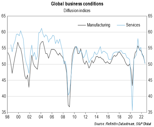
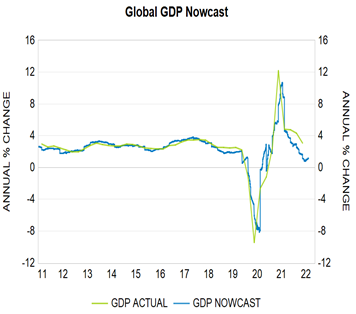
The global economy is facing a series of challenges including high inflation, rising interest rates, government fiscal consolidation, elevated uncertainty, tighter financial conditions and, in China, the impact of COVID-related lockdowns and continued weakness in its property sector. These factors have led to a moderation of global business conditions (Graph 1) with this apparent in even more timely indicators such as our daily ‘nowcasts’ of global gross domestic product (GDP) growth (Graph 2).
Graph 1: Global business conditions
Graph 2: Global GDP nowcast
Source: Refintiv Datastream, Bloomberg, QTC Economic Research
This moderation in activity suggests that it is possible that we are entering a new phase of the economic cycle or will soon do so.
What phase of the economic cycle are we in?
The economic cycle (or ‘business cycle’) illustrates how economic conditions vary over time. Output increases throughout an expansion before peaking in a boom. Momentum will typically then slow down before the economy enters a downturn. At this point output will contract before ultimately troughing, after which the process repeats. In real time it can be difficult to determine which phase of the cycle we are in however.
To address this uncertainty, I use several approaches to assess which phase of the cycle we are in for the domestic and global economies (or if data availability is an issue, the US economy).
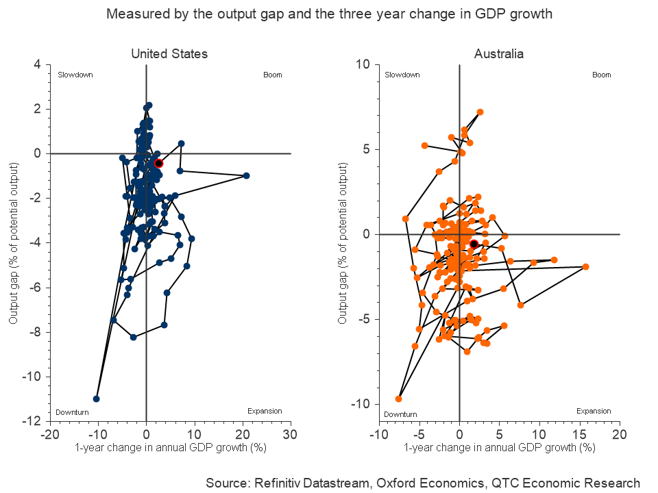
Chart-based approach
If economies followed the pattern laid out above, then we might expect to see neat transitions from one phase of the business cycle to the next. However, while there is some evidence of this, volatility in the data makes it difficult to be clearly observed.
This can be seen in Graphs 3 and 4 below, which aims to show the phase of the cycle US and Australian economies are in, by comparing the change in real GDP growth rates to the size of the output gap over time.[1]
These charts suggest both economies remain in the ‘expansion’ phase, but only just. Moreover, if the change in the GDP growth rate were calculated over the past six months, then both would be in the ‘downturn’ phase. However, it seems hard to argue that either country is in a downturn with unemployment rates the lowest in around 50 years.
Graphs 3 and 4: Australian and US business cycles
Indicator based approach
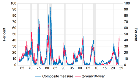
To get around this volatility in the GDP data, other measures which rely on a broader suite of variables can be used to gauge an economy’s position within the cycle. While these sometimes have variable lead times ahead of a downturn and occasionally can give false signals, a reasonable guide as to the peak in the cycle is given when the average of these indicators reaches an upper bound. The composite indicator shows that we might be past the peak in the cycle in the US (Graph 5), though interestingly didn’t reach the upper bound that typically signals a future recession. For Australia, the indictor has not yet turned over, though is elevated and could do so in the period ahead. (Graph 6).[2]
Graphs 5 (US) and 6 (Australia): composite indicators of economic activity[3]
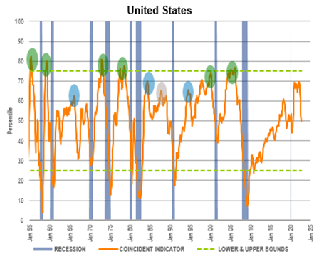
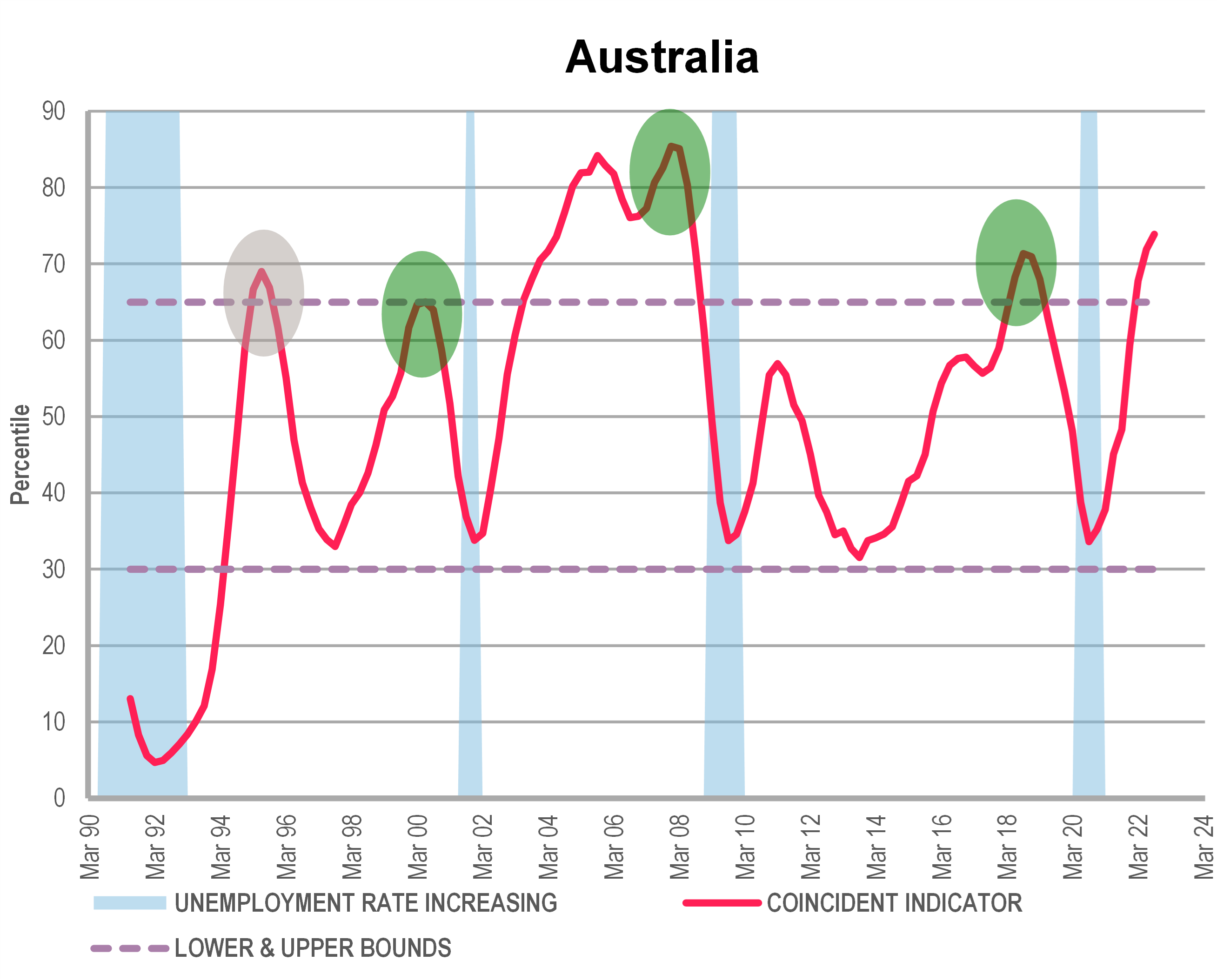
Note: The green circles in the graphs above highlight instances when the indicator peaking above the upper bound correctly signalled a future recession in the US or slowdown in Australia (where a slowdown is taken to be when the unemployment rate increases by three-quarters of a percentage point over a 12-month period). The grey circles show when the indicator provided a false signal about a future recession or slowdown. The blue circles refer to when the US economy experienced a slowdown but did not enter a recession as defined by the NBER. These instances were identified as ‘soft landings’ in a recent speech by the Chair of the US Federal Reserve.
Source: Refinitiv Datastream, QTC Economic Research
Model-based approach
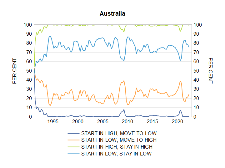
Economic growth rates vary throughout the business cycle. Certain statistical approaches can be used to determine whether the economy is in a high or low growth state. For example, Graphs 7 and 8 show that the global and Australian economies respectively moved from a low to high growth state following COVID-19.
Graphs 7 (Global) and 8 (Australia): Probability of transitioning to different regimes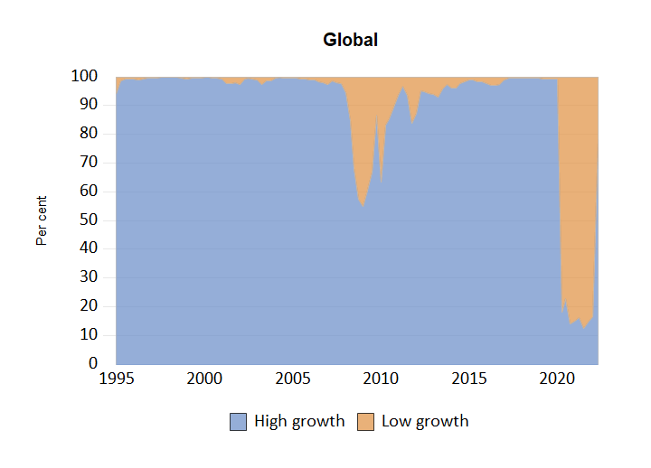
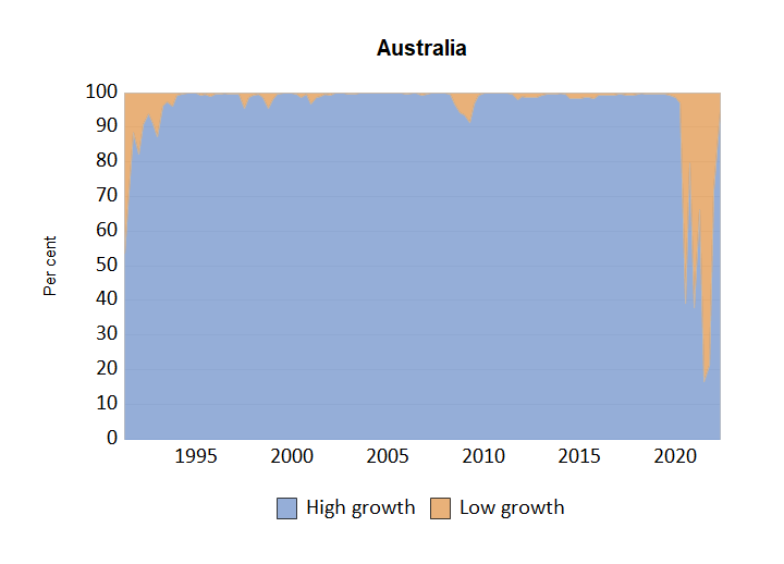
Note: The graphs above show the probability of being in a low or high average GDP growth state. These probabilities were estimated using a two-state Markov Regime Switching Model with regime specific error variances, four lags of GDP growth and one lag of the leading indicator set out in Graph 12 (Australia) and 13 (global) respectively.
Source: QTC Economic Research
These same approaches can be used to estimate the probability of an economy transitioning from a high to low growth state (and vice versa) in the next quarter or of staying in the current state. Graphs 9 and 10 show the probability of transitioning to a low growth state in the near-term is small for the global and Australian economies respectively.
Graphs 9 (Global) and 10 (Australia): Probability of transitioning to different growth regimes
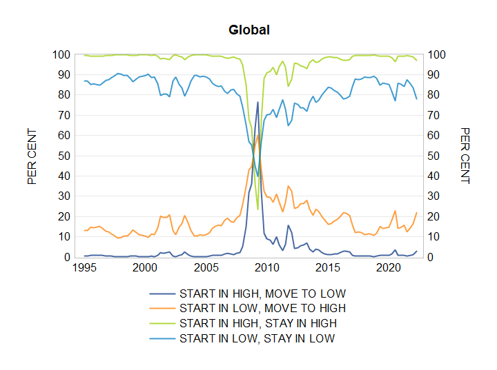
Note: The graphs above show the one-step ahead probabilities of transitioning to different economic growth regimes. This was estimated using a two-state Markov Regime Switching Model with time‑varying transition probabilities and regime specific error variances. The explanatory variables included four lags of GDP growth and one lag of the leading indicator set out in Graph 12 (Australia) and 13 (US).
Source: QTC Economic Research
Gap-based approach
The last approach involves assessing the difference between measures of the current state of the economy and its equilibrium state via a ‘gap-based’ approach. Prior to a downturn it is common for resource utilisation in an economy to be higher than would be observed if it were in equilibrium. This is not sustainable and usually will see a policy response to contain the pressure that this elevated demand places on inflation. This is the case at present.
One example of a gap-based measure that is particularly interesting in the current context is the ‘unemployment gap’. This is the difference between the actual unemployment rate and the lowest level for this, which could occur before inflation started to accelerate. It would normally be the case that in the final part of an expansion this gap would move lower before bottoming out and then starting to rise as the slowdown begins. For the global and Australian economies there is no sign yet of a levelling out in this gap (Graph 11), though this could be coming soon given that unemployment rates in both countries have been around current levels for some months now.
For Australia, the unemployment gap hasn’t been this low at any time this century outside of the commodities boom, pointing to the possibility that it could soon bottom out. This is consistent with some leading indicators of the labour market seemingly having peaked. However, there are reasons to think that the unemployment rate might take longer than normal to move higher.[4] This suggests that measures based on it might be more of a lagging indicator of where we are in the cycle in the current unusual circumstances than normally might be the case.
Graph 11: Global and Australian unemployment gaps
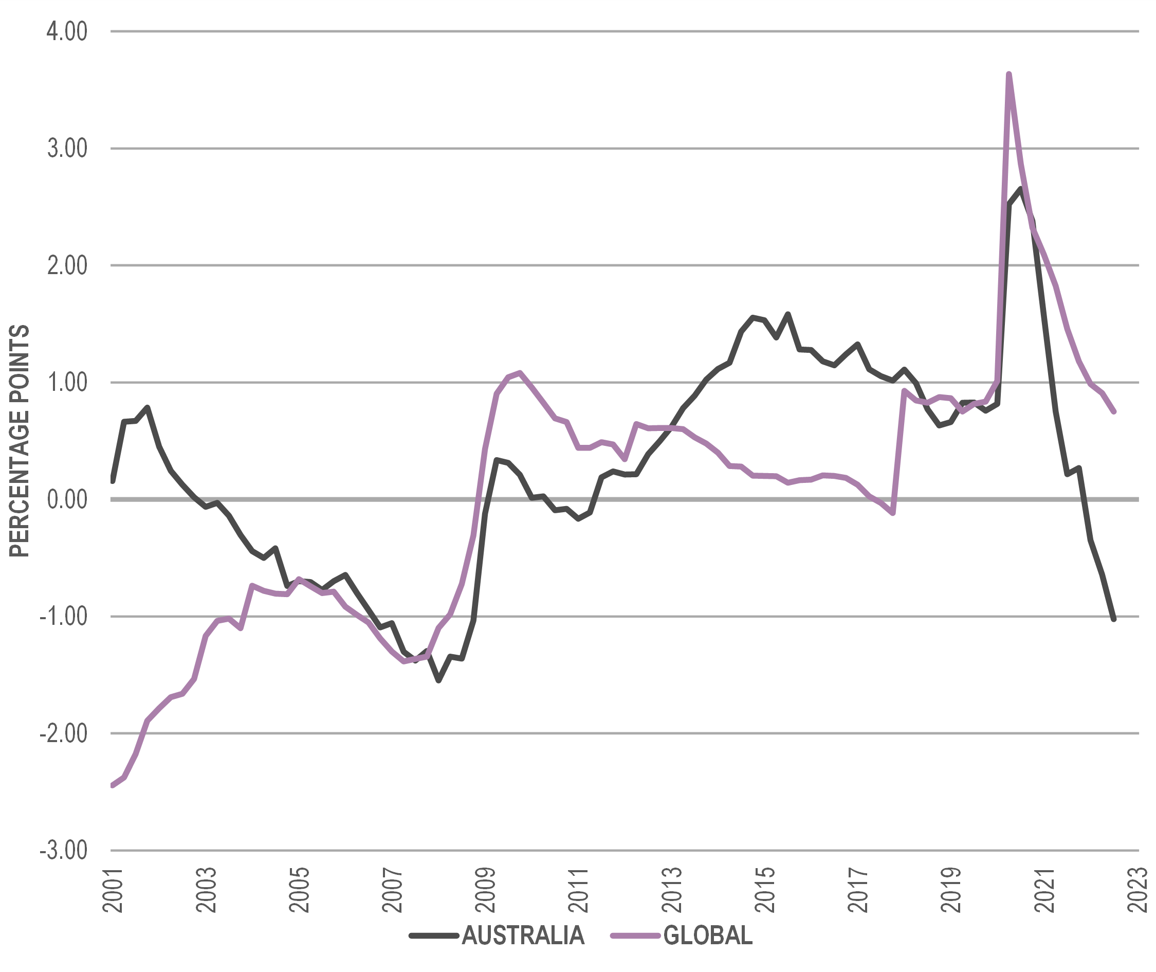
Note: The global unemployment gap is the difference between the GDP-weighted unemployment rates and estimates of the non-accelerating inflation rate of unemployment (‘NAIRU’) for a sample of 44 countries making up between 70 and 75 per cent of global economic output. The Australian unemployment gap was estimated by my colleague, QTC Principal Economist Trent Saunders, using the approach described by Cusbert (2017)
Source: Refinitiv Datastream, Oxford Economics, QTC Economic Research
What is the outlook?
The different approaches suggest that the international (global/US) and Australian economies both remain in an expansion phase (Table 1). However, while this result is reasonably uniform at present, several of the indicators appear close to shifting to a more negative status. This suggests that we may not be far away from transitioning towards a slowdown or downturn, consistent with the weakness signalled by leading indicators of future economic activity for the Australian (Graph 12) and US (Graph 13) economies.
Table 1: Summary of assessments
| Indicator | Global or US | Australia |
| Chart | Expansion* [US] | Expansion* |
| Composite | Slowdown [US] | Expansion* |
| Model | Expansion [Global] | Expansion |
| Gap | Expansion [Global] | Boom* |
Source: QTC Economic Research
* – Currently indicates expansion but appears close to possibly changing status towards either slowdown or downturn
Graphs 12 (Australia) and 13 (US): Leading indicators of economic activity
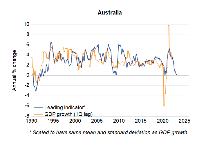
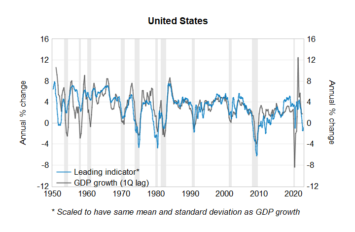
Source: Refinitiv Datastream, QTC Economic Research
It is also consistent with an update to our earlier estimates of the probability of a recession in the US in the next 12 months (Graph 14). This has risen to now be above 20 per cent and it may not take long to get to the threshold (30 per cent), which has historically been an accurate signal for a future recession. The size and speed of the US Federal Reserve’s increases to interest rates, as well as the lags before these fully take effect make a recession in the back half of next year a strong possibility. This could be an outcome that may be experienced by many other countries around the world as we move to the next phase of the economic cycle.
Graph 14: Recession probabilities for US economy (12 month ahead)
Source: Refinitiv Datastream, QTC Economic Research
In July, the International Monetary Fund’s (IMF’s) Chief Economist noted that the ‘outlook has darkened significantly’, that risks to it are ‘overwhelmingly tilted to the downside’ and that the world ‘may soon be teetering on the edge of a global recession’. In October, the GDP growth forecasts of IMF economists for next year were revised lower for 75 per cent of countries representing 90 per cent of global GDP (Graph 15).
Graph 15: Downward revisions to GDP growth
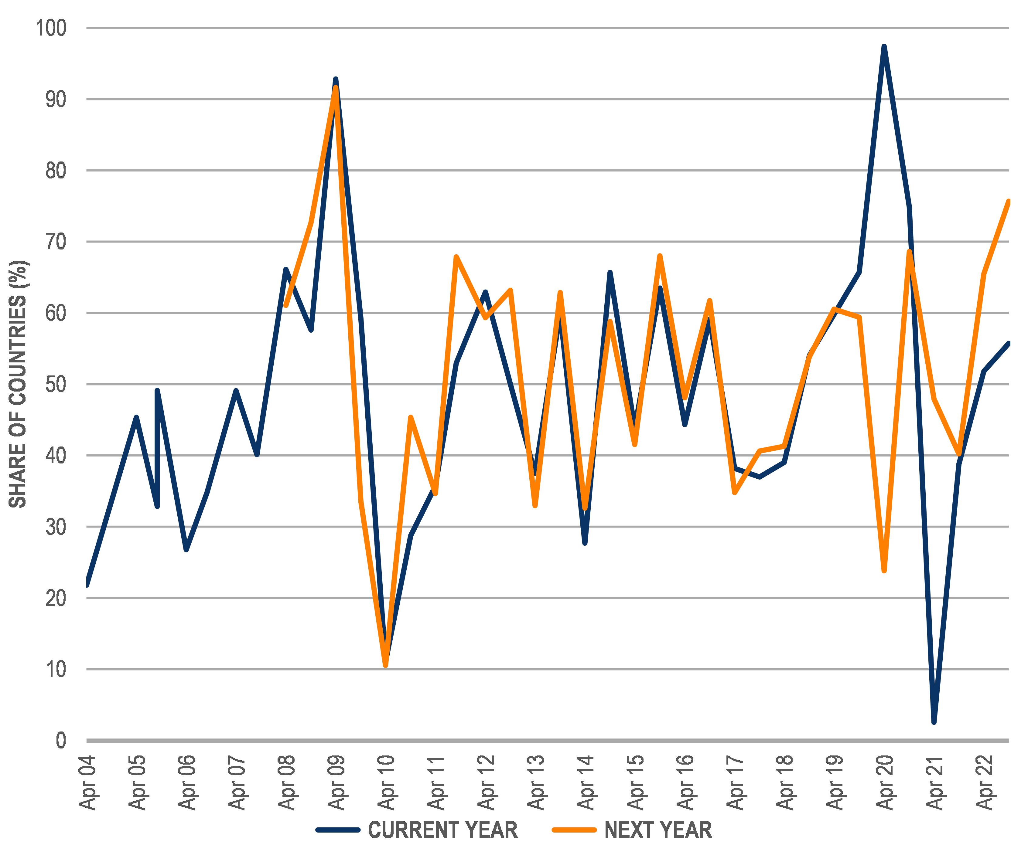
Note: This graph shows the proportion of downward revisions amongst all countries to see a forecast change in the semi-annual update of the IMF World Economic Outlook
Source: IMF World Economic Outlook, QTC Economic Research
But that it’s not all. The IMF anticipates that:
- countries representing about one‑third of global GDP could experience a ‘technical recession’[5] this year or next
- that there is around a one-in-four chance that global growth could fall below two per cent (a level which, on a rounded basis, has only been breached three times in the past 40 years), and
- that there is a 10 to 15 per cent probability of global growth of around one per cent.
We are not yet in that phase of the economic cycle, but may not have to wait too long.