How do we measure labour market slack?
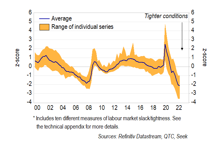
Timely measures of labour market slack are a key input into monetary policy decisions. There are several alternative measures of spare capacity – or ‘slack’ – in the Australian labour market. While all of them are currently pointing to very tight conditions, the perceived degree of tightness varies depending on the measure (Graph 1).
Graph 1: Indicators of labour market slack
Unemployment, underemployment and underutilisation
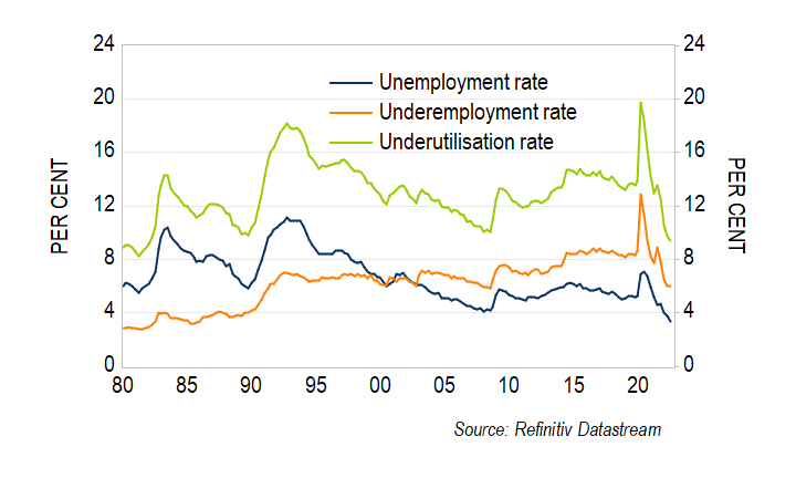
The unemployment rate has historically been used as a primary indicator for conditions in the labour market. It measures the share of the labour force that is not employed but is actively searching for a job. While the unemployment rate is a very useful benchmark for labour market slack, it is not perfect.
One potential shortcoming of the unemployment rate is its narrow focus. This has seen increased attention on measures of labour market slack that directly account for underemployment – that is, the share of workers with jobs but who want to work more hours. In Australia, much of this attention has been on the underutilisation rate, which includes both unemployed and underemployed individuals.[1]
The underutilisation rate should account for slack that cannot be directly gleaned from the unemployment rate. In particular, the increased prevalence of part-time work has seen the underemployment rate trend higher over the past 30 years (Graph 3). Research from the Reserve Bank of Australia (RBA) suggests that this higher underemployment helps explain wage outcomes in Australia, with the underutilisation rate having a closer relationship with wages growth than the unemployment rate over the past 20 years.
More recently, all three of these measures have fallen sharply in response to strong demand for labour. The unemployment rate is at its lowest level in almost 50 years, the underutilisation rate is at a 40-year low, and the underemployment rate is at its lowest level since 2008. The steep falls in both unemployment and underemployment are a strong signal that conditions in the labour market are tight.
Graph 2: Underutilisation rate
Unemployment gap
Economists often use statistical techniques to estimate the degree of slack in the labour market. A common approach is to estimate the ‘unemployment gap’, which is the difference between the unemployment rate and the ‘non‑accelerating inflation rate of unemployment’ (NAIRU). The NAIRU is the unemployment rate that is consistent with inflation being stable and in line with its long-run expectations, so it is of particular interest to monetary policymakers.[2]
One benefit of this approach is that it accounts for a range of different factors that affect the relationship between the unemployment rate and inflation. For example, if higher underemployment adds to labour market slack, then inflation will be lower for a given level of unemployment. This implies a lower NAIRU and a larger unemployment gap. Indeed, this seems to be the case. When I estimate a ‘NAIRU’ for the underutilisation rate, the downward trend that is evident in standard NAIRU estimates largely disappears (Graph 3). Taken at face value, this suggests that the increase in underemployment can explain much of the downward trend in the NAIRU over the past decade.
Graph 3: Estimates of the NAIRU
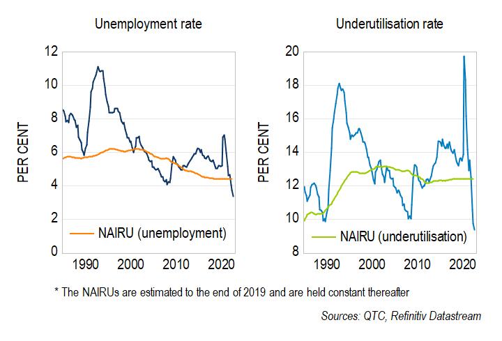
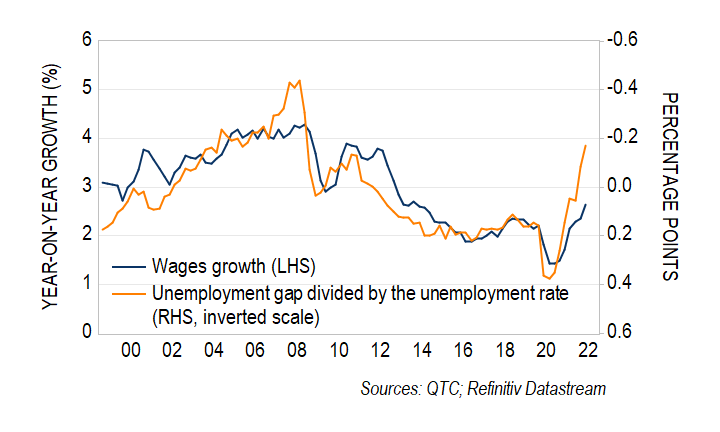
The current unemployment rate of 3.4 per cent is well below most estimates of the NAIRU, which currently range from 4 to 5 per cent.[3] My estimates suggest that the unemployment gap (ie, the difference between the unemployment rate and the NAIRU) is at its lowest level since at least 2008 (Graph 4). This is consistent with a pick-up in wages growth over the coming year.
Graph 4: Unemployment gap and wages growth
Job advertisements and vacancies
The job vacancy-to-unemployment ratio is another common indicator of labour market tightness. This measure suggests that conditions tighten when there are fewer would-be workers relative to the number of jobs that need to be filled.
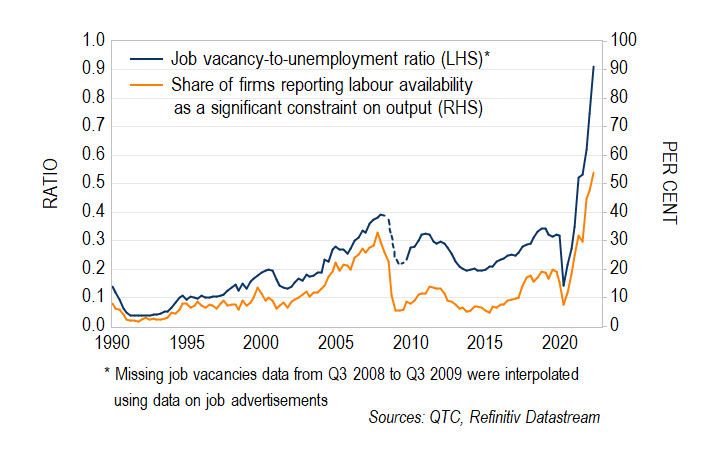
The job vacancy-to-unemployment ratio points to very tight labour market conditions at present. For the first time since at least 1980, there are now more vacant jobs than there are unemployed persons. In comparison, at the peak of the mining boom, there were 2.5 unemployed persons for each vacant job. This has seen the share of firms reporting the availability of labour as a significant constraint on output increase to its highest level on record (Graph 5). Nonetheless, there are signs that this momentum has started to slow, with new job advertisements (as distinct from job vacancies) easing slightly in recent months.[4]
Graph 5: Job vacancies
Which indicator provides us with the best read on wages growth and inflation?
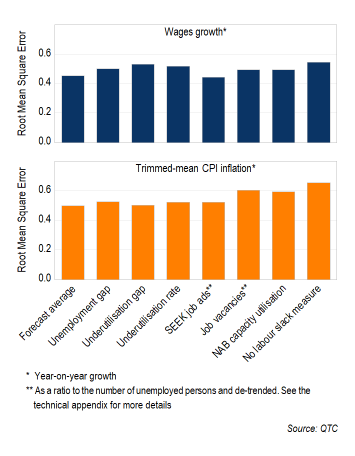
I have constructed a range of forecasts using different measures of labour market slack, to assess which is the most accurate for forecasting inflation and wages growth. The technical appendix provides more detail on this exercise.
For the period from 2005 to 2019, the most accurate indicator of wages growth one-year ahead was job advertisements (Graph 6). Nonetheless, there is little difference in forecast accuracy across the different models. This is in contrast to recent research for the US, which has found that the job vacancy-to-unemployment ratio more noticeably outperforms other indicators for forecasting wages growth.
Similar to wages growth, the accuracy of the inflation forecasts is not significantly different across the various models. Moreover, for both wages growth and inflation, the average of the various forecasts performs just as well as the best individual indicator.
Graph 6: Forecast accuracy (2005 – 2019)
What is the outlook for wages growth and inflation?
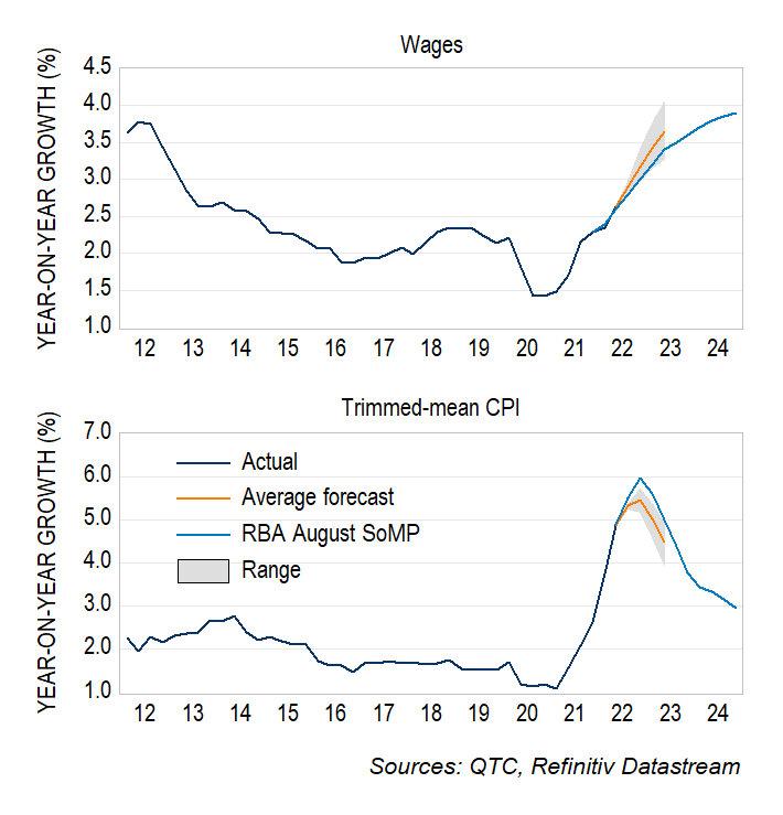
These models provide a range of outlooks for wages growth and inflation (Graph 7). The average forecast from the models suggests that wages growth will pick up to 3.7 per cent by the middle of next year. This is broadly in line with the consensus across market economists but is higher than the RBA’s forecasts.
In contrast, the models have a slightly weaker outlook for inflation relative to the RBA. This is likely explained by my estimates focusing on inflation that is driven by the current strength in labour demand, rather than any impact from lingering supply-chain disruptions.
Importantly, the range of forecasts illustrates the benefits of looking at a variety of indicators when assessing the outlook for wages and inflation.
Graph 7: Forecasts of wages growth and inflation